Enhancing the user experience by optimizing usability on the e-commerce site
Role
UX Designer
Tools
Figma
Team
1 Brand manager, 1 Brand Designer, 1 Developer, 1 UX Designer.
OVERVIEW
Bounty is an American brand of paper towel manufactured by Procter & Gamble, promising to be 'the quicker-picker-upper.' The bounty.shop website hosts all the product experiments created for the brand to test with a select group of consumers. Though the site doesn't experience high traffic, it's critical for the brand to provide an intuitive user experience to boost conversion rates and achieve higher levels of satisfaction and engagement.
THE CHALLENGE
How might we drive excitement for our TLE products by making the user experience on the site more pleasing, seamless, and easier to navigate?
THE OUTCOME
A website that prioritizes user-friendly design and accessibility. Changes would be reflected in higher user engagement and conversion rates, such as purchases.
MY ROLE & STAKEHOLDERS
During my internship I worked on multiple projects for the Family Care business unit at P&G. For this particular project I had the opportunity to work with a brand manager, a brand expression designer and a developer, who constantly guided me regarding limitations, available resources, and offered creative feedback on my work.
In this particular project, my responsibilities included conducting a heuristics evaluation, creating a user journey map, and assisting with design proposals.
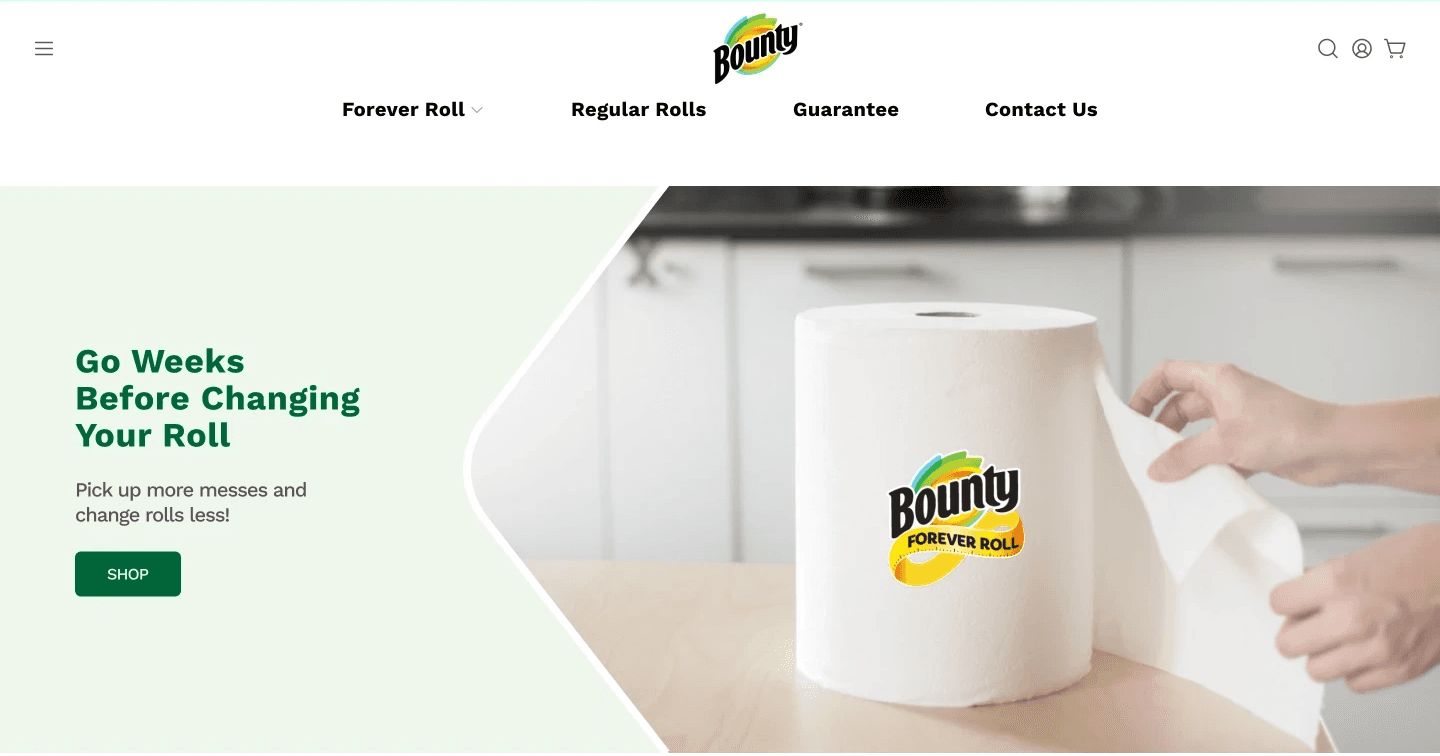
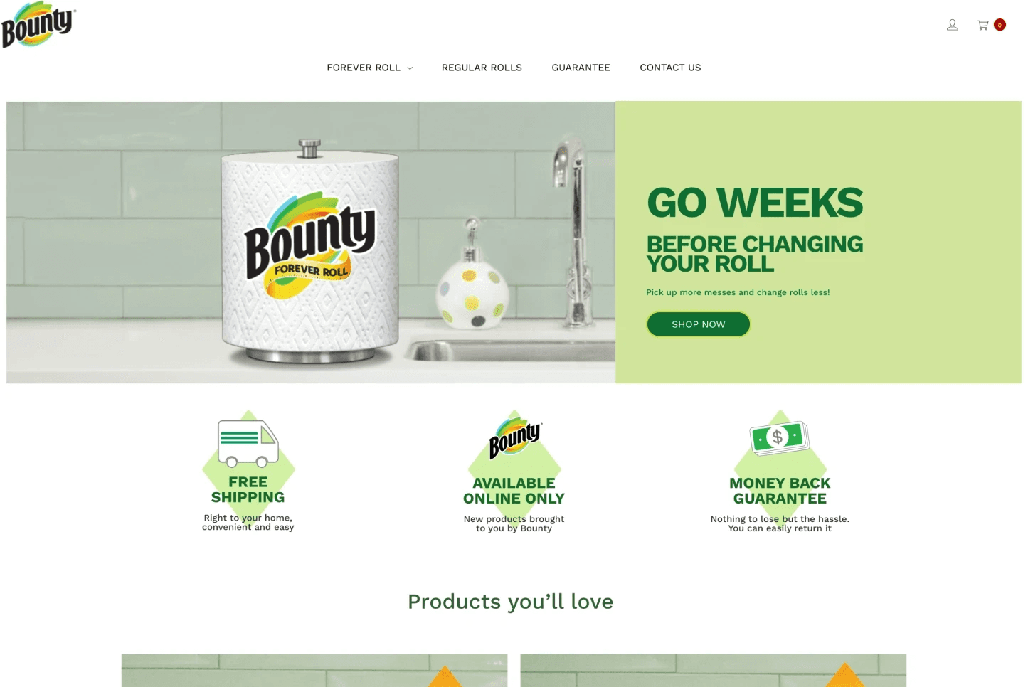
OLD WEBSITE
Bounty.shop is a site to sell the “transaction learning experiments” or TLEs products to test with few consumers.
Design process
0.1 HEURISTICS EVALUATION
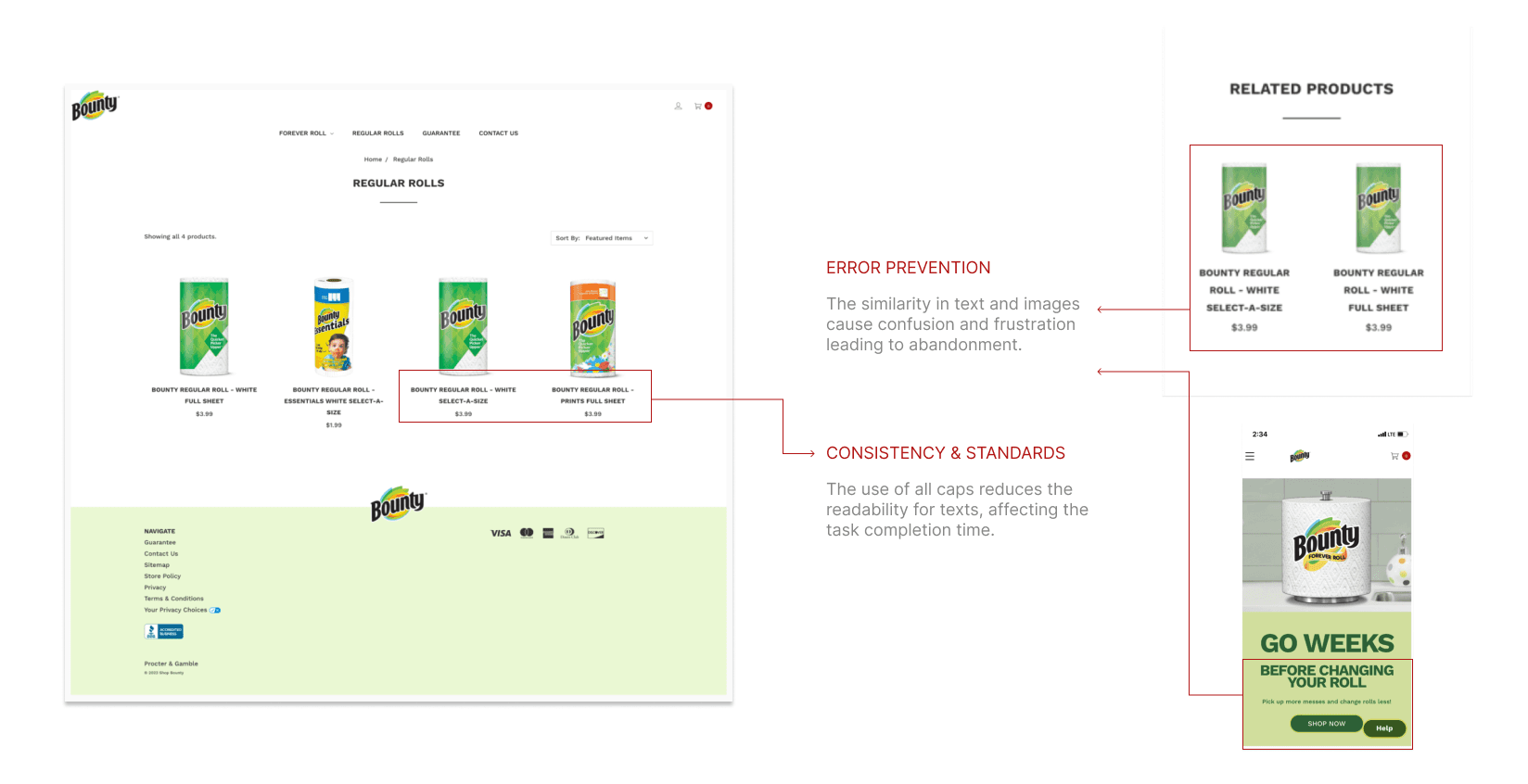
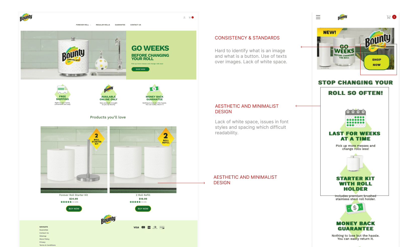
I needed a quick and inexpensive way to uncover detrimental issues affecting the overall experience on the site. Nielsen's 10 heuristic principles were critical in helping us prioritize next steps and raise awareness among the team about best usability practices, see some of the findings below.
0.2 COMPETITIVE ANALYSIS & USER JOURNEY MAP
I conducted a competitive analysis, and built a user journey map with the information provided from a usability test, the insights gotten from research were useful for the next steps of my design process.
*Due to NDA, I can’t share more details about my the competitive analysis and a user journey map.
MAJOR FINDINGS
Based on the heuristics evaluation and the user journey map, these were the most critical and urgent issues that needed to be addressed.
User control and freedom
Consistency
Readability
Final Designs
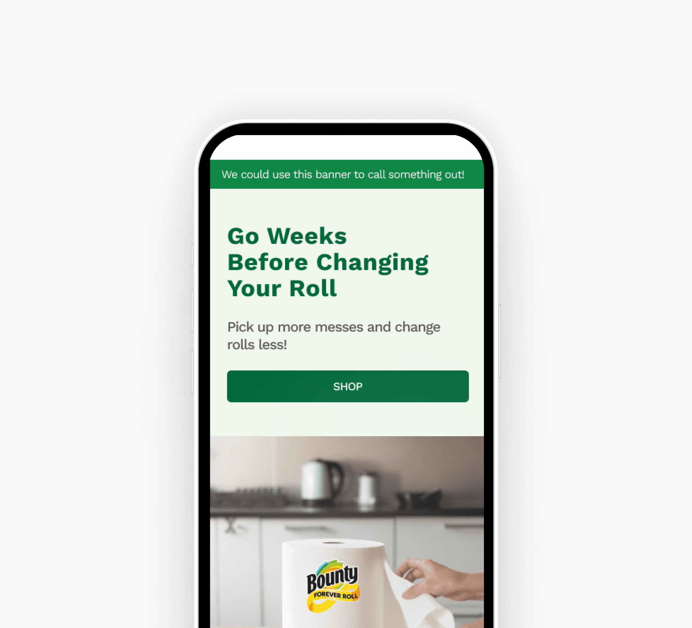
Elements like buttons, icons, selectors, spacing, padding and alignment were fixed and adjusted to improve consistency and readability.
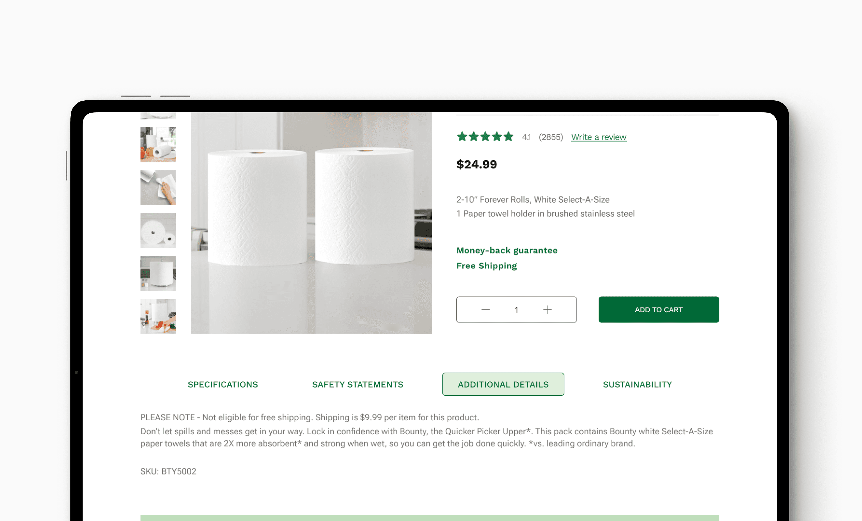
Product section
Visual design
The product design section was redesign, a tabs component was added to help user navigate through key information at the purchase decision making process. Sustainability info was added.
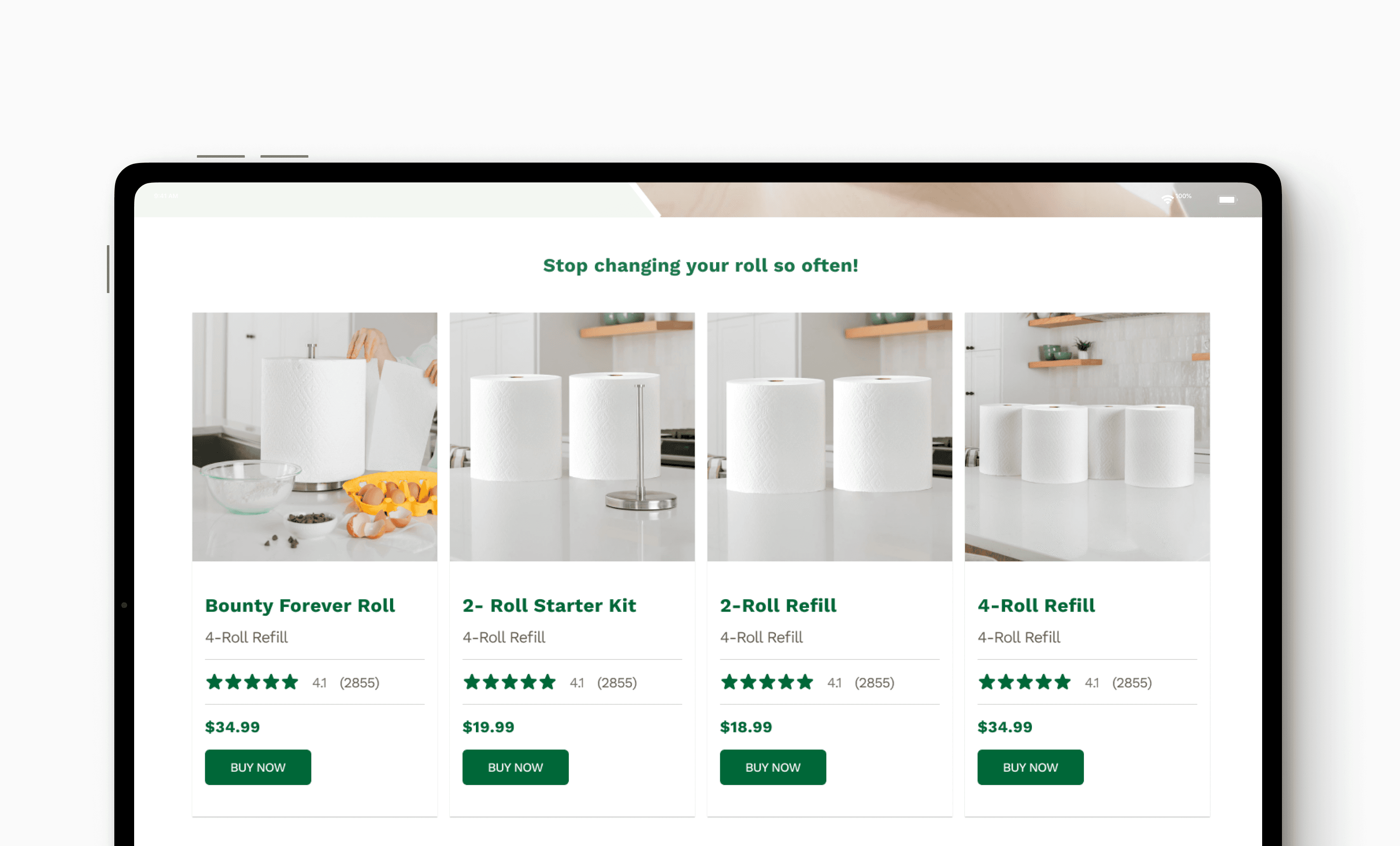
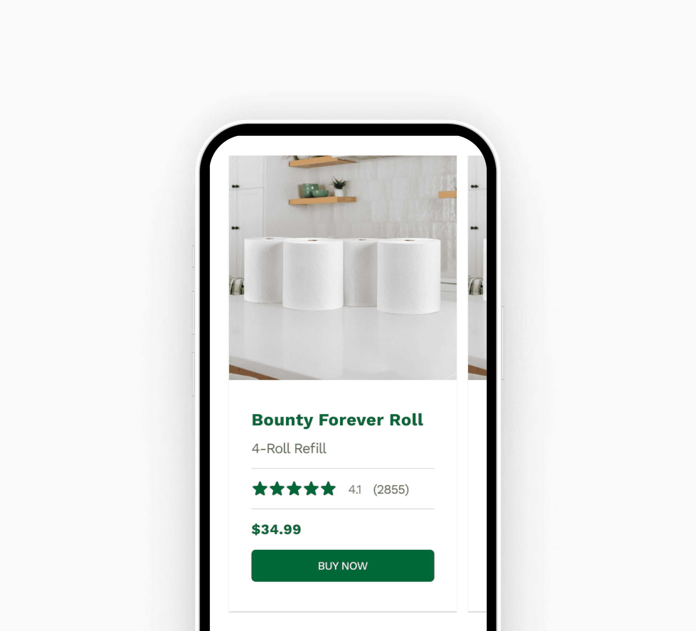
Product cards
The design of the product cards for both mobile and desktop was improved allowing higher readability.
Key learnings
Collaborating closely with cross functional teams is essential to ensure the right tools and best practices are being used towards a common goal.
Being proactive when communicating with your team, by seeking for feedback, support and collaboration. This would help you understand constraints, expectations and increase your visibility within the team.
Confidently articulate and defend your design ideas and choices, backed by research and user-centered principles.
Project management: Establish a well-defined plan early on, familiarize with available tools and resources , and set clear milestones to meet deadlines.
