OVERVIEW
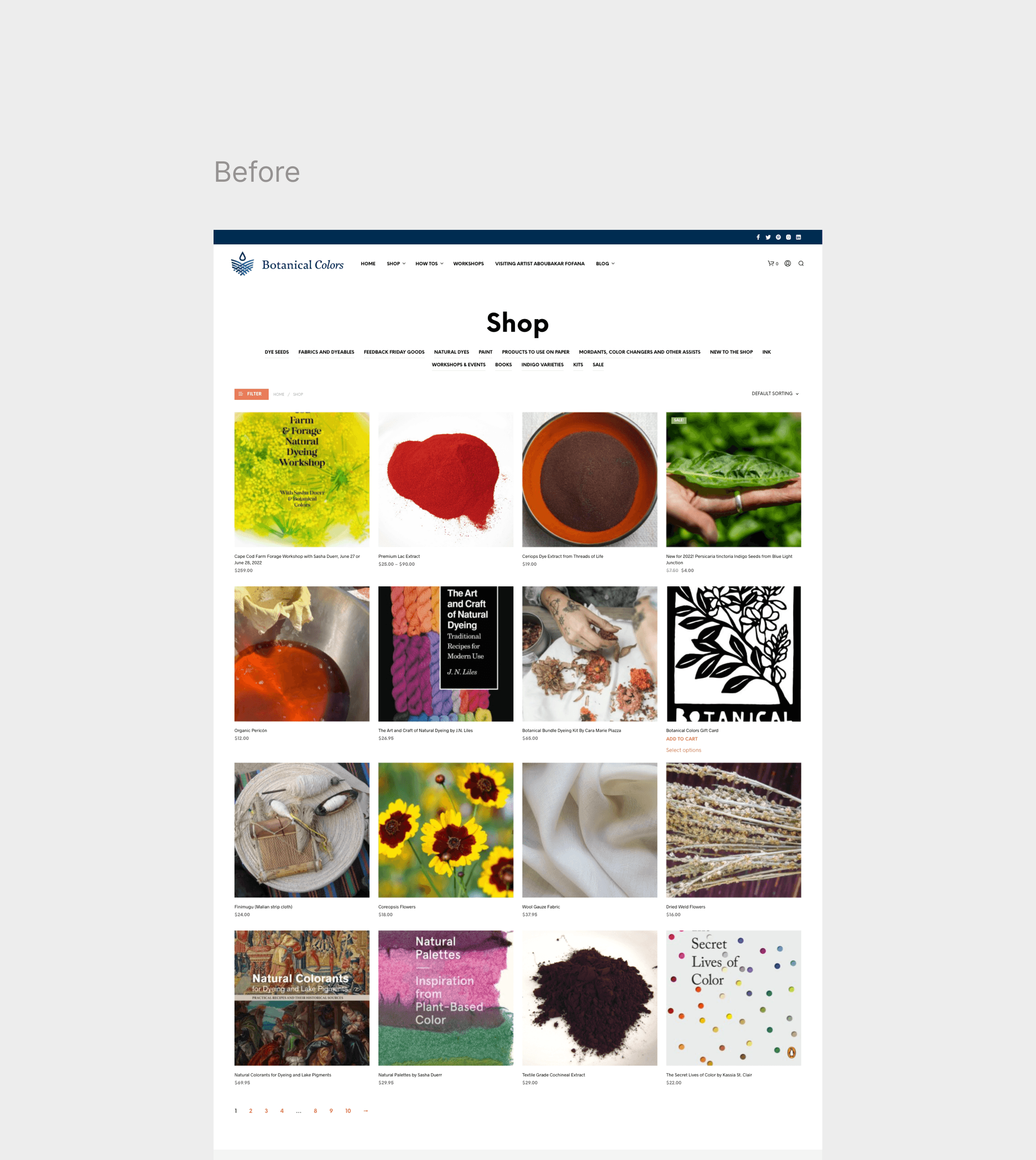
Botanical Colors is a Seattle-based studio that offers natural dyes and education to artisians, dye houses and industrial clients around the world. Their website provides users with lots of content, products and workshops for the natural and eco-friendly dyeing process, but it presents critical issues for the users since it isn't built to match their mental models.
THE PROBLEM
Although the website has tons of content about dyes, ingredients, fabrics, workshops and trends, it was not clear for the user how to properly use the products and which are the steps they should follow in order to dye at home. They still face issues during the purchase and after purchase.
HMW
How might we increase product knowledge, and make sure users have a smooth experience when purchasing all they need to complete the dying process?
THE OUTCOME
A new purchase flow that will have higher customer satisfaction, lower error rate and higher user retention rate.
THE SOLUTION
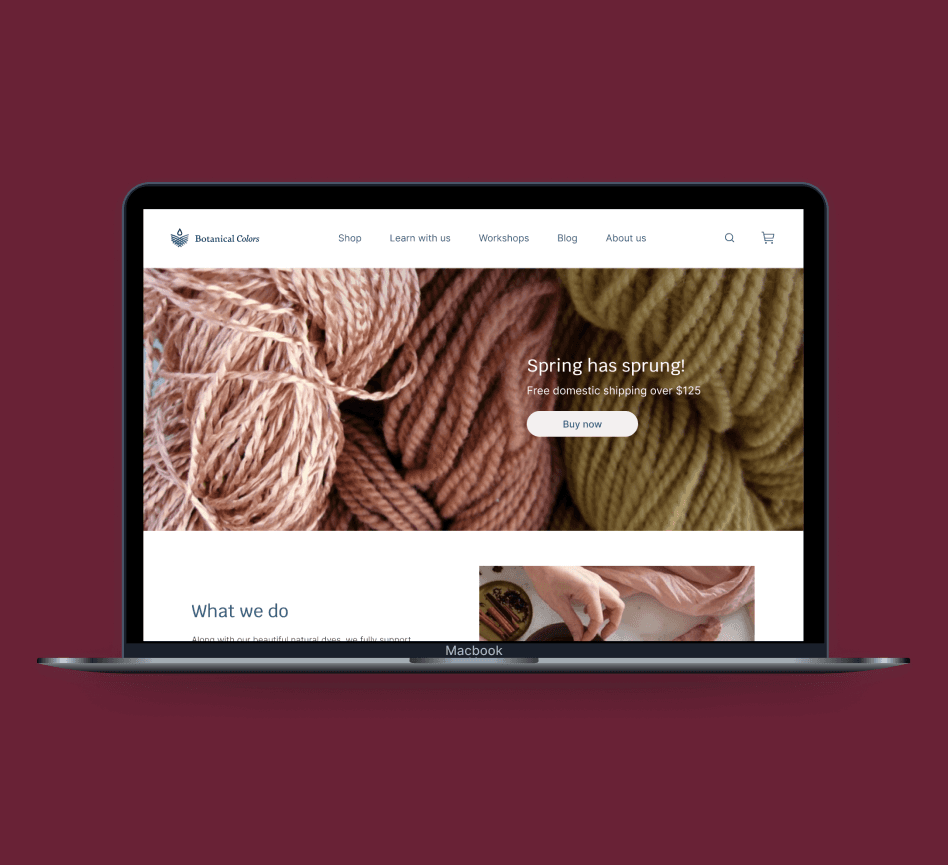
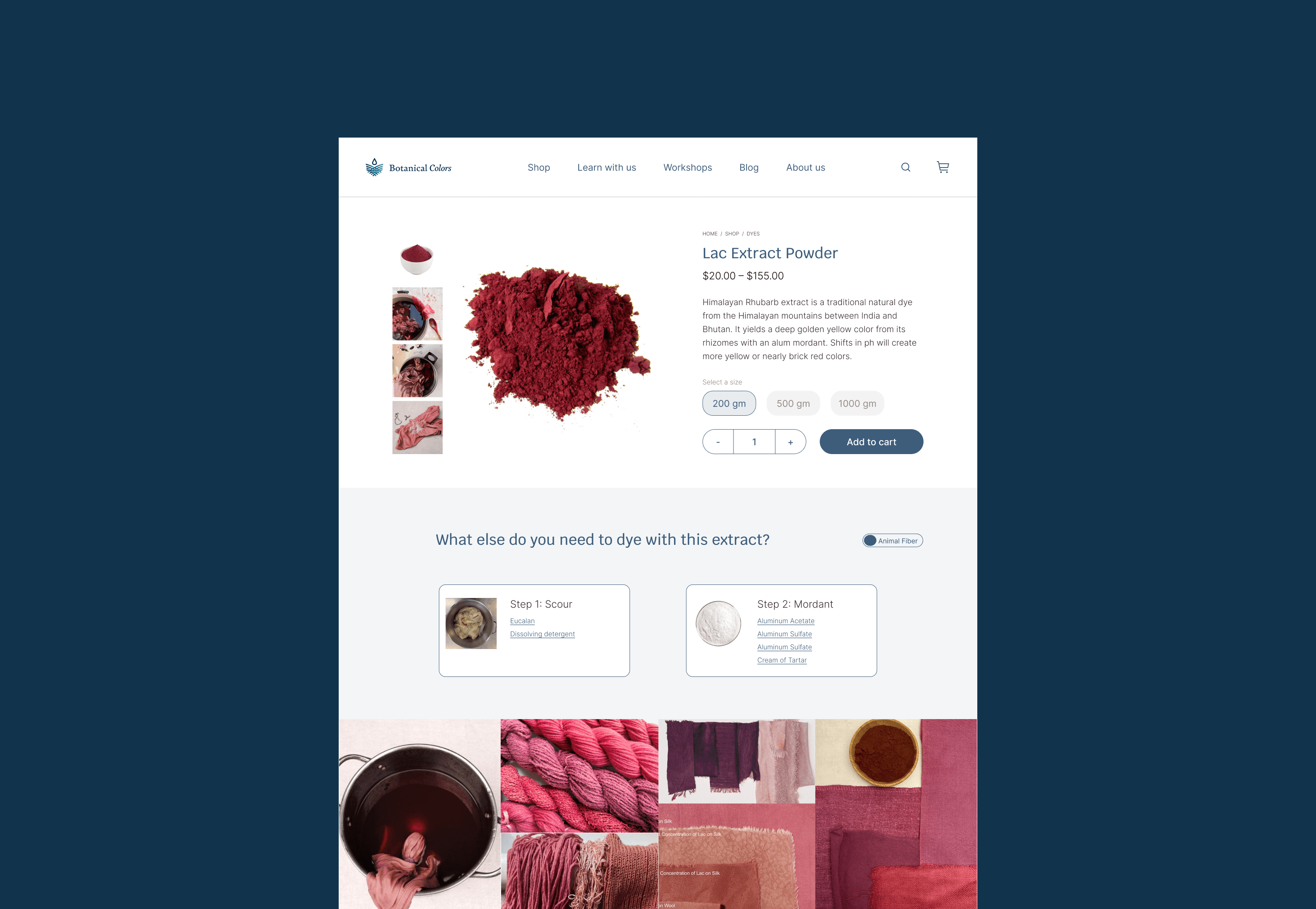
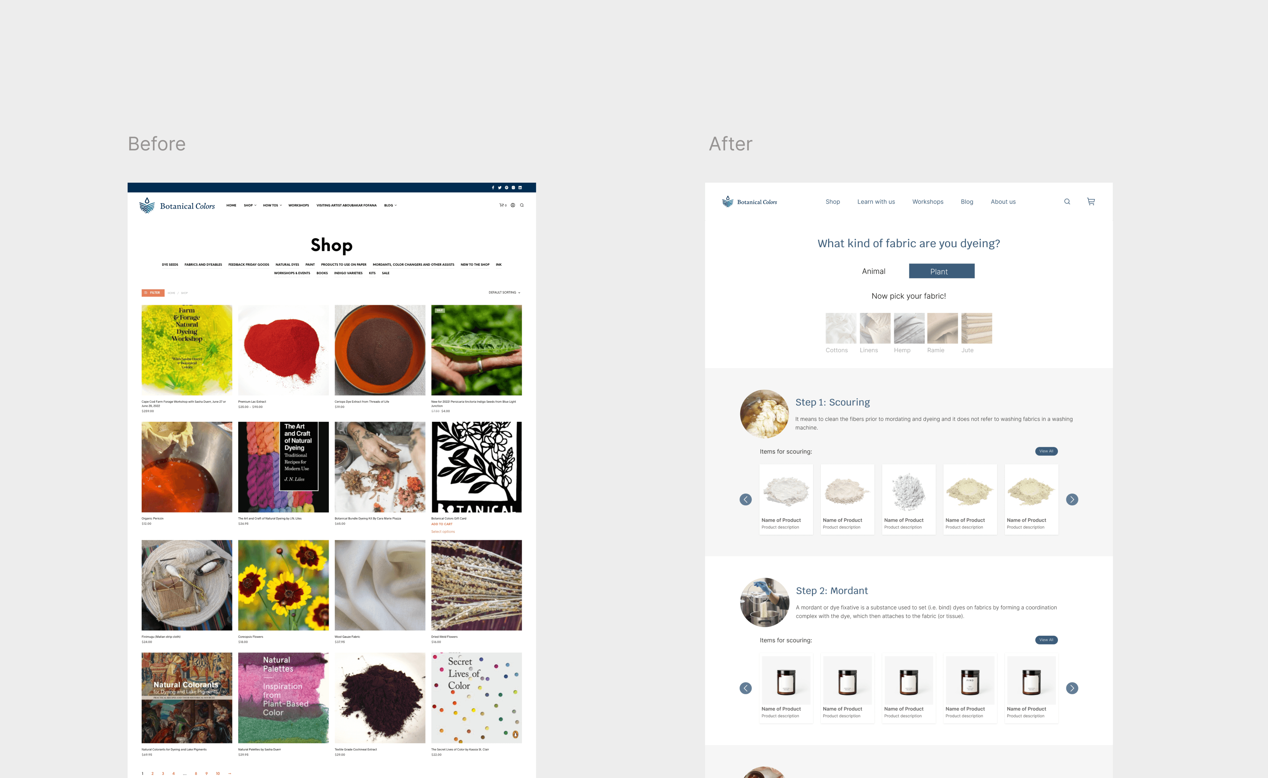
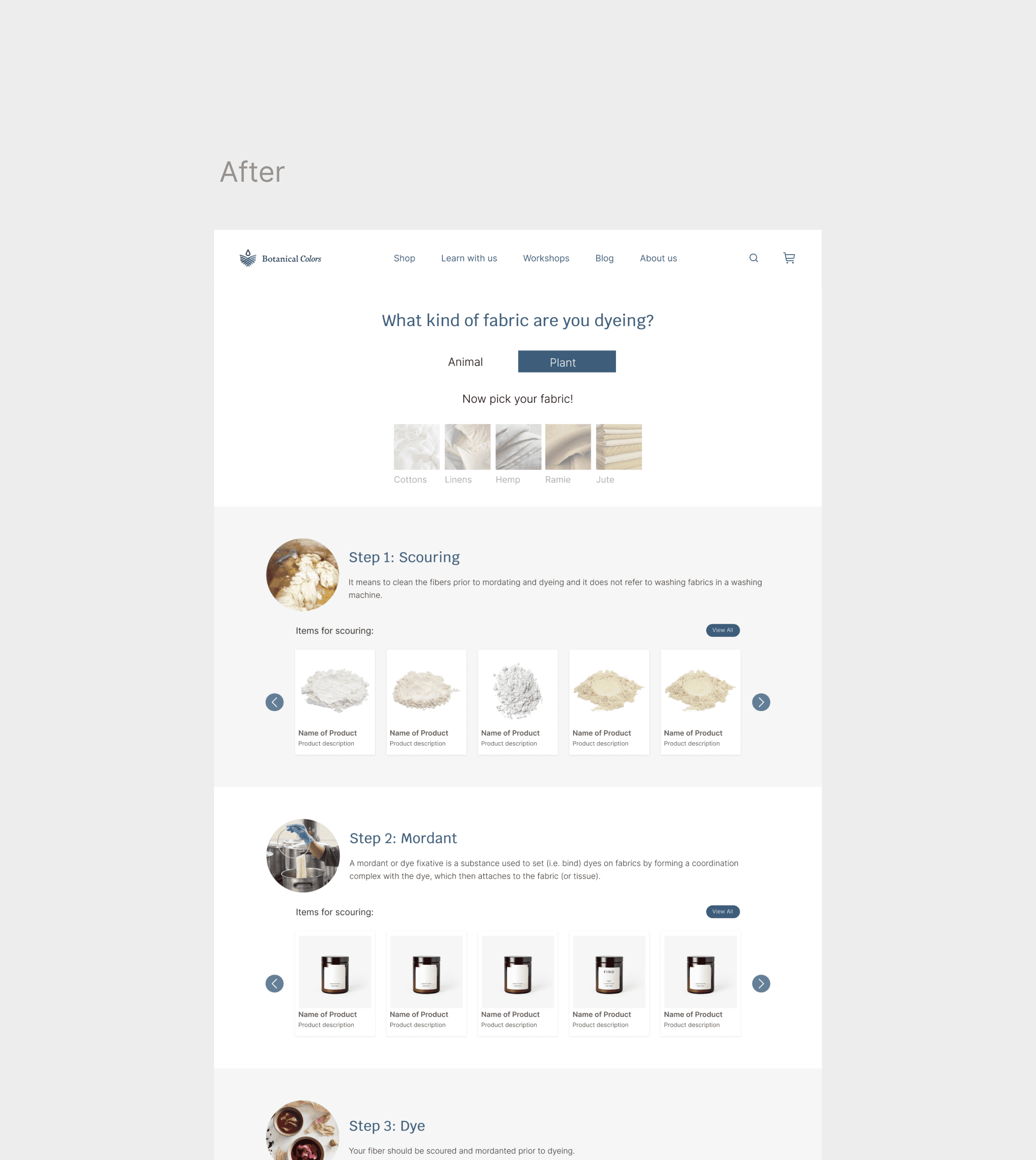
A new purchase flow where users would be guided from the home page all the way through the product page and given with enough content about the dyeing process, its variants and all the products needed for the type of fabric they are using, all of this will allow them to make an informed purchase decision.
My design process
0.1 UNDERSTANDING THE USER
To kickstart this project, it was crucial to gain an understanding of the users, their journey on the site and their main needs. We learned about their goals and challenges, we closely examined their behavior on the site and identified the main pain points that they were facing. We conducted interviews with not only our key stakeholders but also with three selected customers.
Interviews
30-40 min video call interviews via Zoom, recorded and transcribed.
Participants
Interviewees including: Key stakeholders and current customers.
Sample questions
How much time do you spend shopping for dyes every week?
Are you familiar with the dyeing process?
What will you do to find the product?
RESEARCH INSIGHTS
Differences on the fibers
We learned the dye process varies drastically from one fiber to another, that wasn't mentioned on the site anywhere.
Information Architecture Issues
Interviewees aren't familiar with the categories and dyes.
Product lack of knowledge
Lack of visual content
Use of jargon
Content is overwhelming and unreadable.
Product lack of knowledge
All users agree on wanting to learn more about the dyeing process.
Users don't know it takes several ingredients and a whole process to finish a dye at home.
0.2 DEFINING
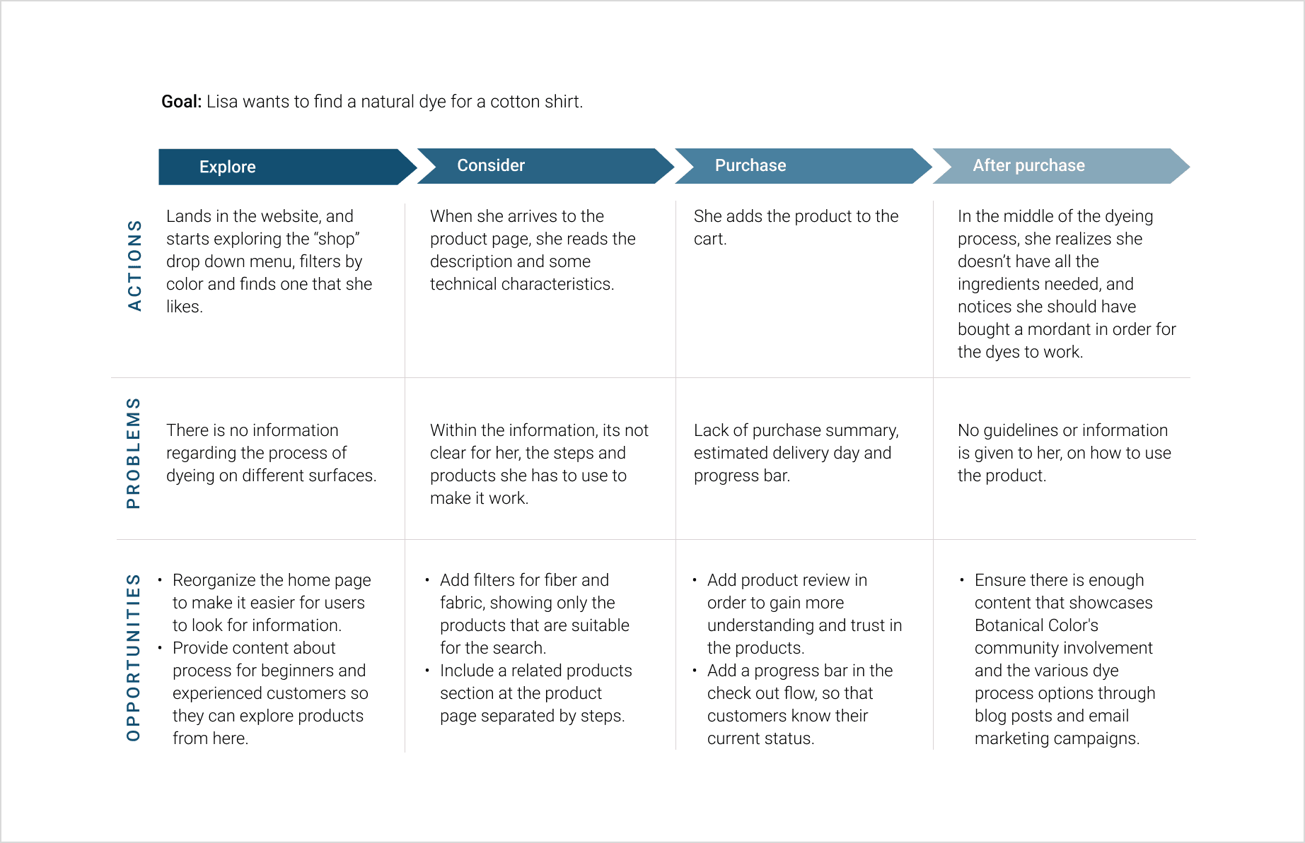
The next phase of the project was focused on analyzing the data gathered from the usability test and the interviews. Our goal was to determine the most critical pain points in the user experience that needed to be urgently addressed. Thanks to the user journey map and brainstorming sessions, we were able to identify opportunities and features that could significantly enhance the overall flow and that needed to be consider in the ideation phase.
User Journey Map
By using the data from the interviews and usability tests, we mapped the process that a user goes through in order to purchase dye supplies.
We identified some opportunities and features such as the "fiber filter", that were going to help optimize the experience.
HOW MIGHT WE
How might we increase product knowledge, and make sure users have a smooth experience when purchasing all they need to complete the dying process?
0.3 DESIGN
At this point we started to think out of the box. I built a totally different new flow from the home page all the way through the checkout page.
Sketching Solutions
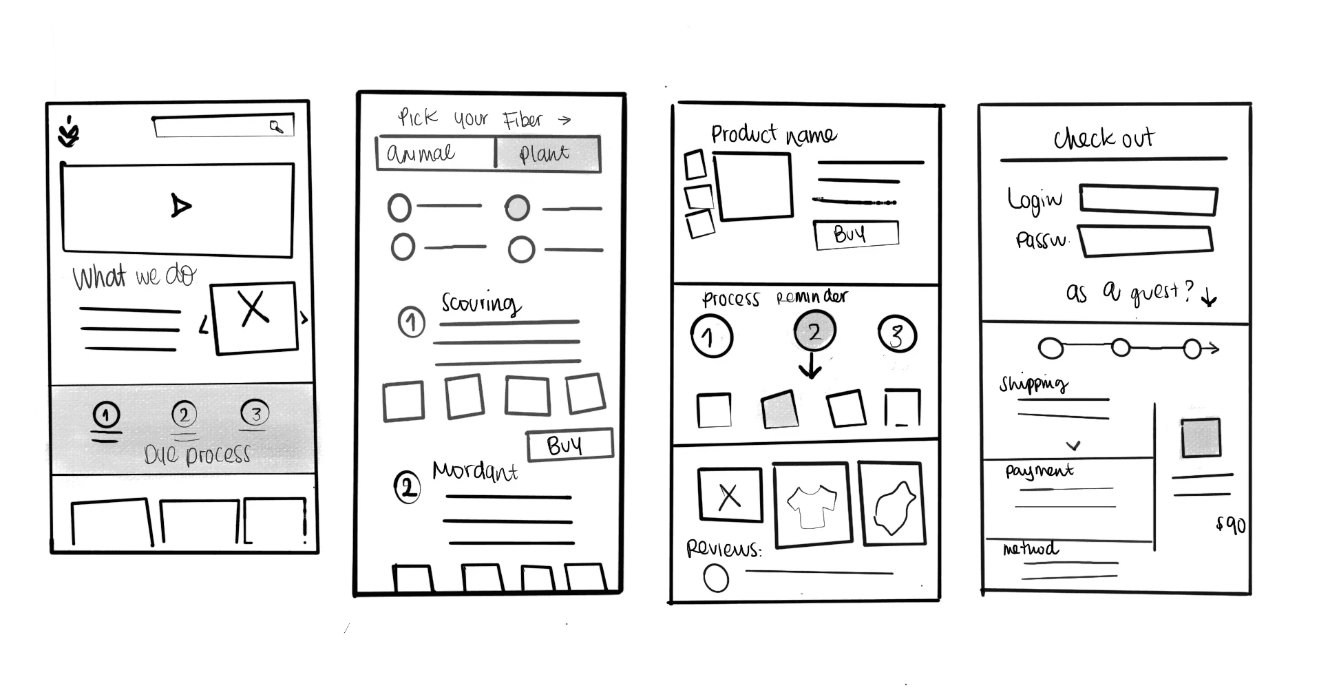
After getting a better understanding of our consumer and the main pain points they were facing in their journey, we got together to brainstorm different ideas.
We knew the main addition to the flow needed to be a feature that differentiates the process of dyeing a Plant vs Animal fiber, so we included the "pick your fiber" page.
0.4 TESTING WITH USERS
Usability Test #2 - Feedback
They loved the idea of being reminded about the steps and process before checking out.
Users were interested in seeing applications of the product in different surfaces.
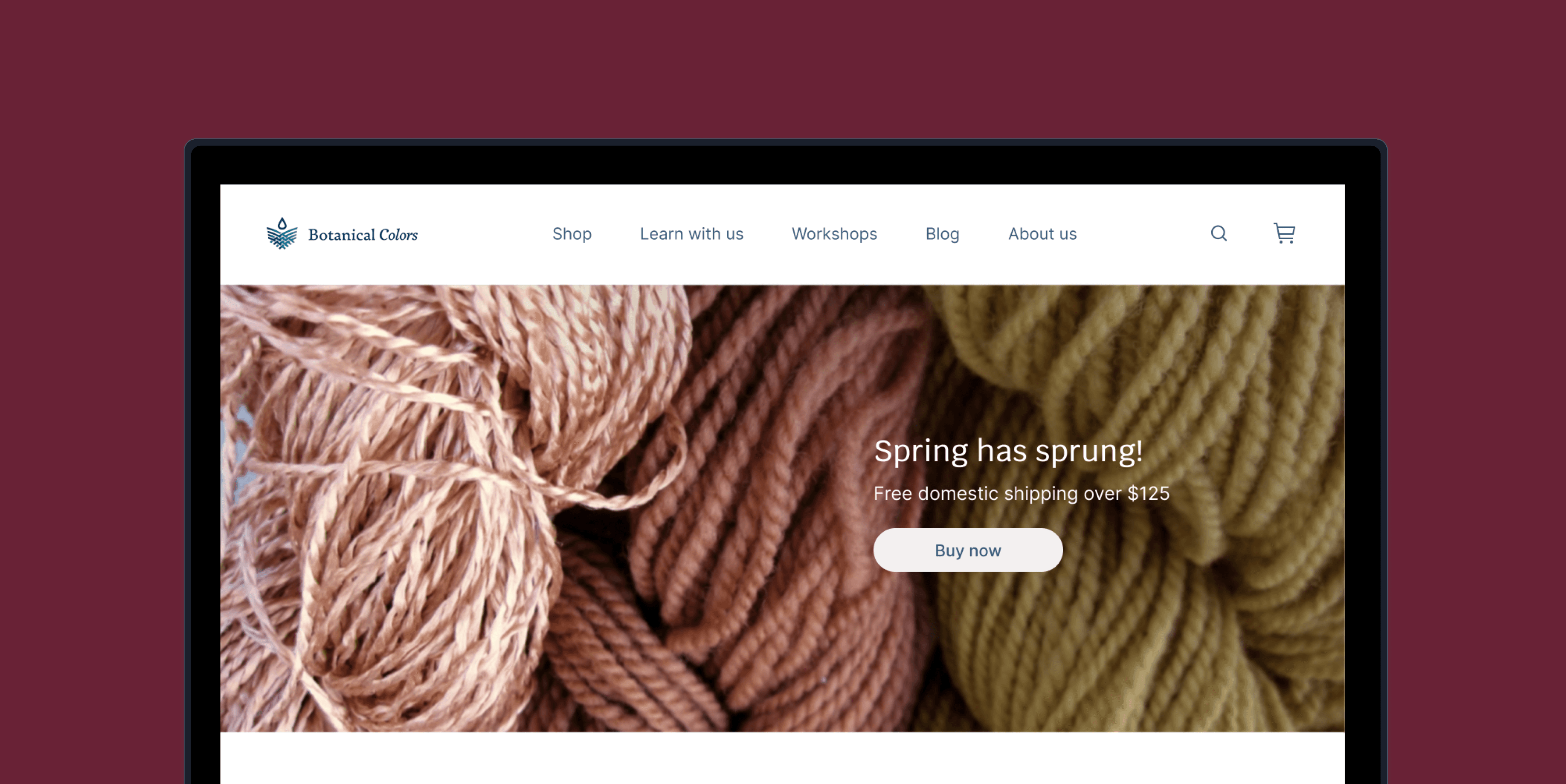
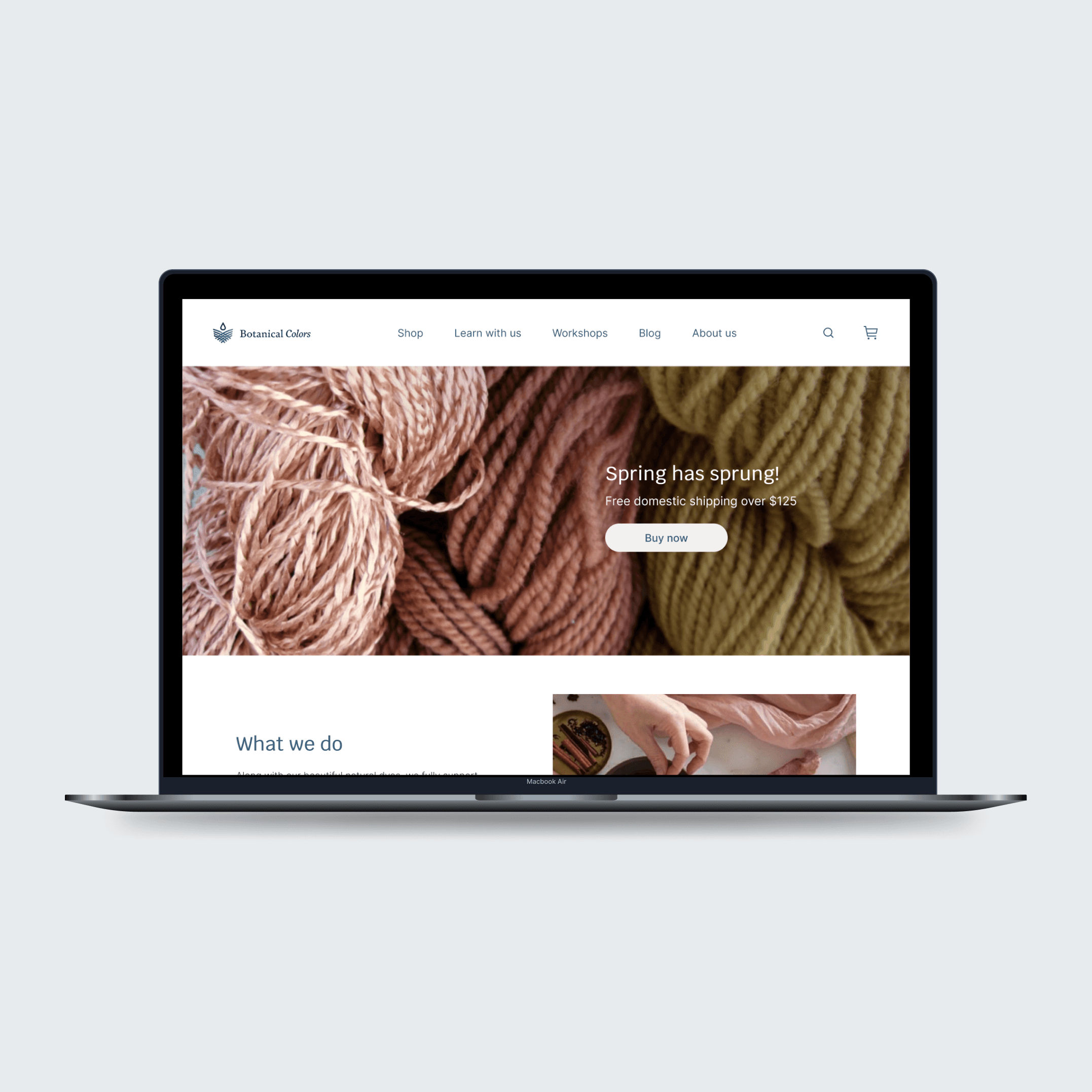
They really liked the dyeing process banner in the home page.
Users found the Dyeing categories in the proposed dropdown menu useful
FINAL DESIGNS
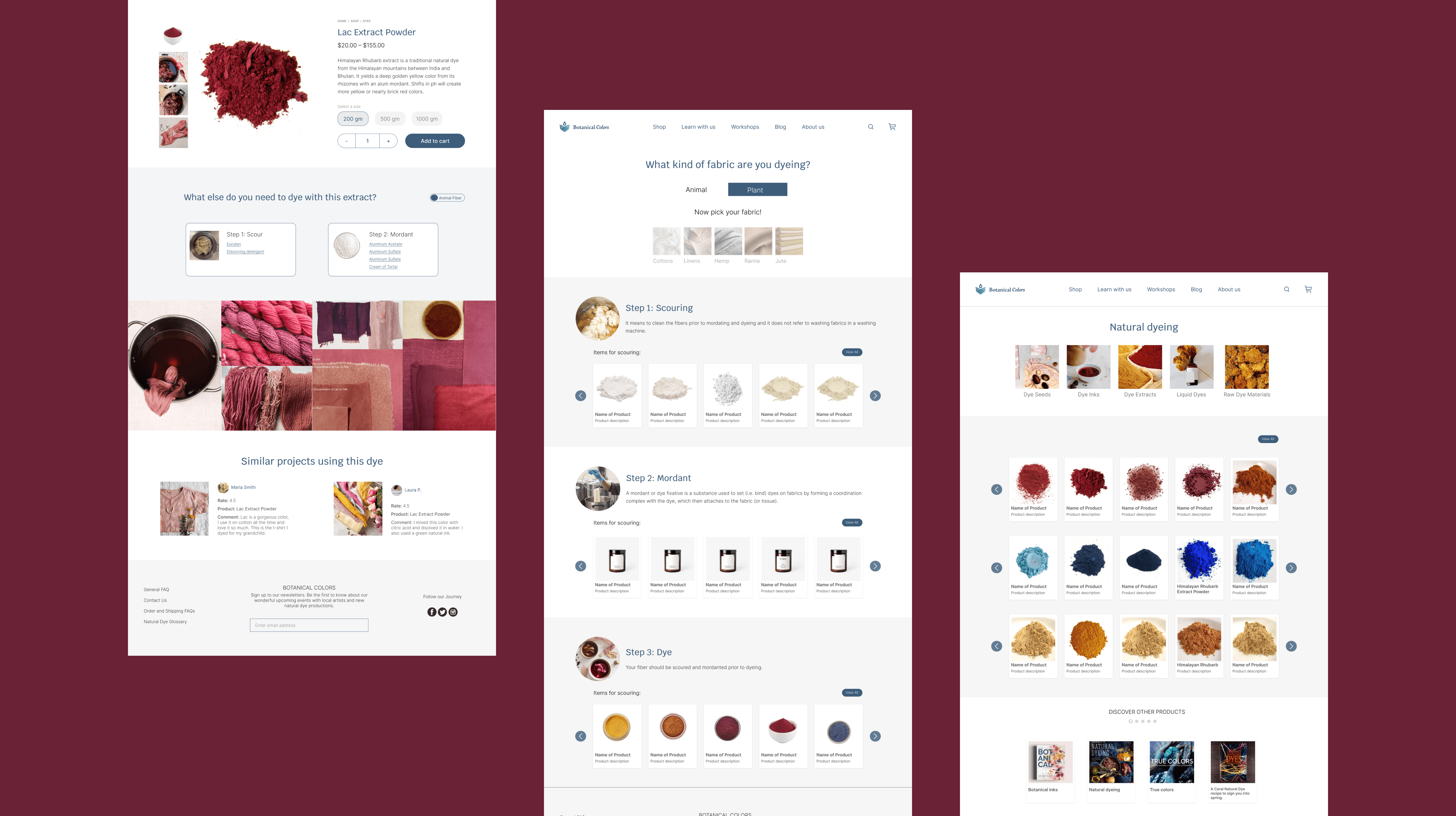
Let's explore the final product!
A new user-friendly site that will guide users through the entire natural dyeing process, and that will allow them to efficiently complete an informed purchase.
Keep scrolling

"A unique way of solving one of our largest stumbling blocks, which is that the customer does not know about the dye process which can influence whether they purchase or abandon our site."
Kathy Hattori, Botanical Colors
Key learnings
Getting involved into business practices and procedures is critical in order to understand what information should be provided to the user. Through our interviews with the client it never came up that the dyeing process varies depending on the kind of fiber the person uses. We discovered this through an interview with one user and that information was critical for us in order to build the right features.
Usability tests are so critical in the success of a product and you should conduct as many as needed.
It is very important to understand what is the intent of new users behind the product, this could determine the success on them finding what they need on the website or abandoning without converting. Although we conducted various interviews, we didn't fully understand how the intend behind buying a "natural dye" is caused on users, until the second usability test.
