Creating an internal website to foster community & communication | 16 weeks
Role
UX Designer
Tools
Figma, Optimal Workshop
Team
1 PM, 1 Brand manager, 1 UX Designer.
OVERVIEW
Family Care Business Unit
Procter & Gamble's Family Care Business unit is responsible for well-known brands such as Bounty, Charmin, and Puffs. With a workforce of over 5,000 employees spread across various business and manufacturing plants, there was a need to establish a unified platform that fosters connectivity, communication, celebration, empowerment, and a strong sense of belonging.
THE PROBLEM
The absence of a dedicated intranet platform tailored to employees' needs, which extends beyond a generic page primarily used for file storage and employee announcements, has led to a lack of engagement, disconnection, and a sense of not belonging among employees within the Family Care Business Unit.
REQUIREMENTS & CONSTRAINTS
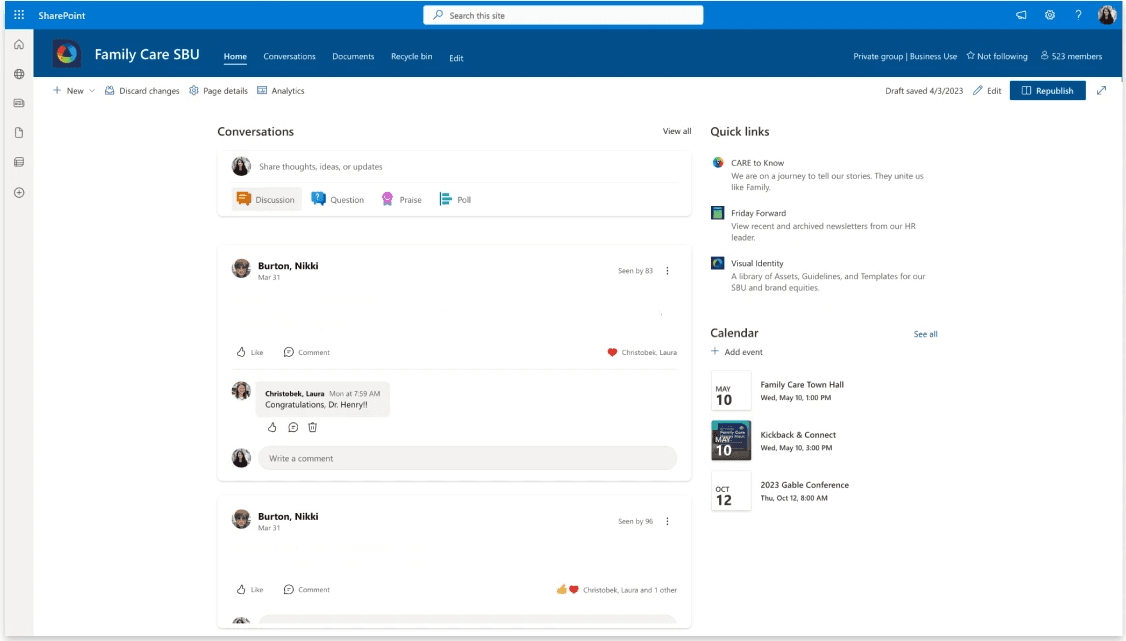
The site must live under Sharepoint to comply with P&G standards.
The Information Architecture must incorporate the value system of the business unit "The vibe to thrive".
THE SOLUTION
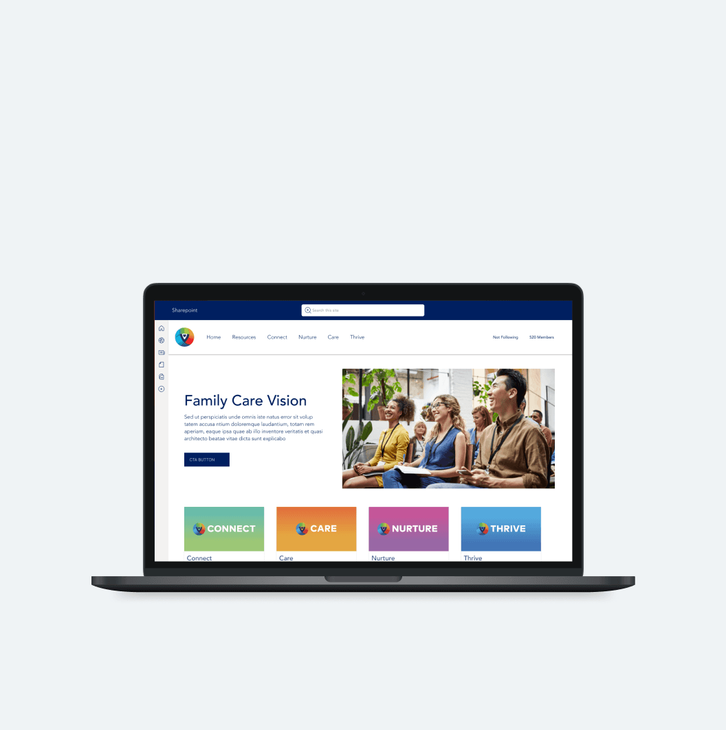
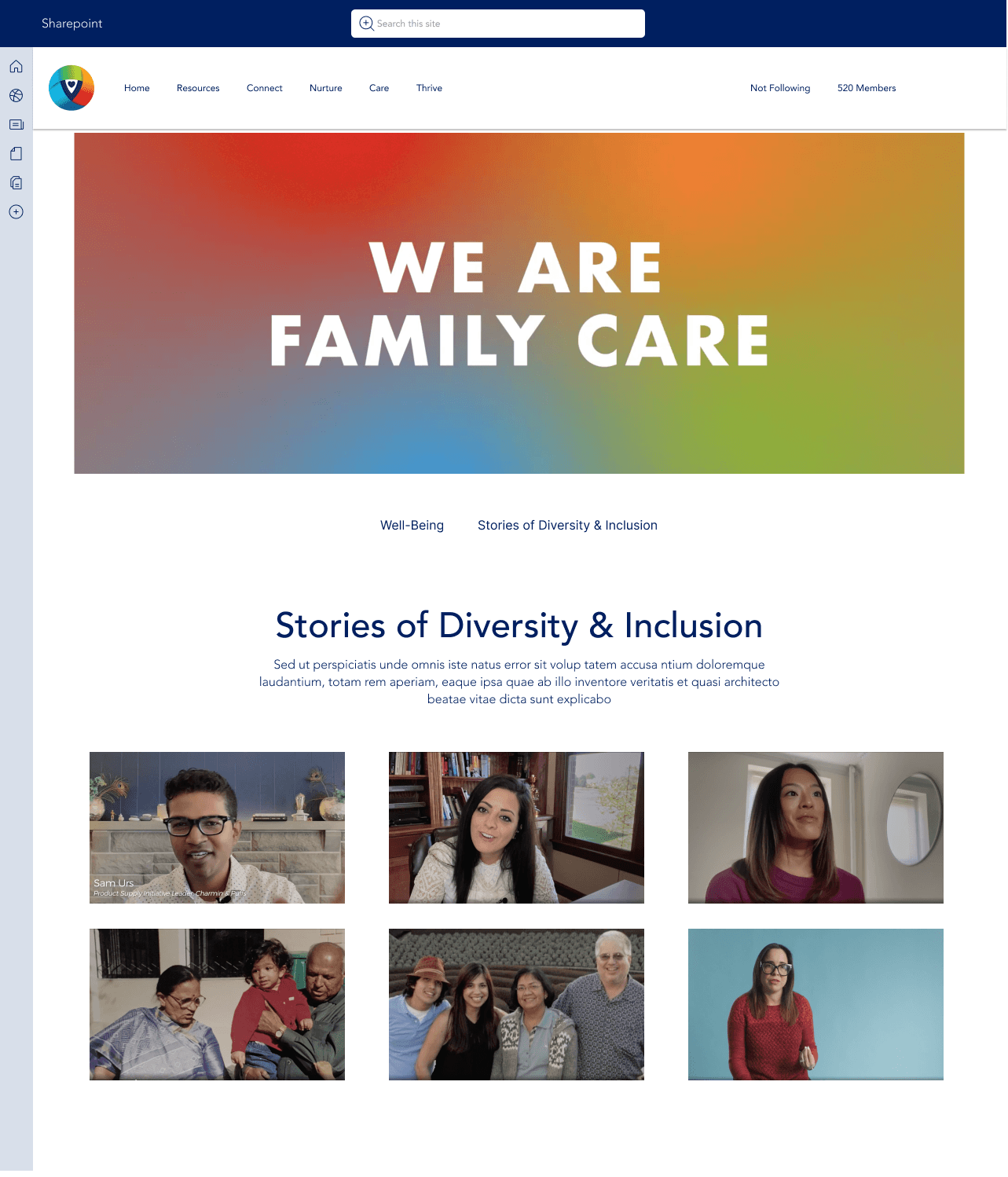
A brand new internal site that supports the family care employees in both the plants and offices. A site that facilitates collaboration, communication, file storage and information in a very intuitive and accesible way.
IMPACT
This project reached over 5000 people across the family care business unit, it decreased the time and effort it takes to access information, assets, files and past work, resulting in an increase in productivity in all departments overall.
My design process
0.1 UNDERSTANDING THE PROBLEM
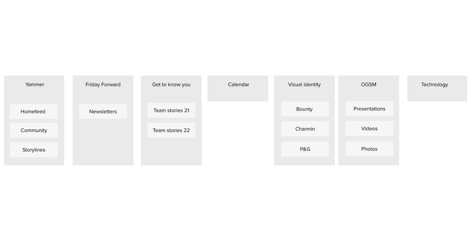
The original intranet site was built as a generic Sharepoint file storage page, it was mainly used as a repository for newsletters and design files. However, it didn't operate as support to the overall family care employee experience.
IDENTIFYING USER'S NEEDS
As the intranet had relatively low traffic, I had access to only limited data concerning user behavior, most visited pages, and bounce rate metrics. In an effort to empathize with users and gain insights about their needs and motivations regarding the employee site, I conducted research using methods such as surveys and card sorting exercises, all of this with the purpose of determining the job to be done.
0.1 Surveys
Among the different questions, I asked 20 people from different departments: What would be the main reason for you to visit the family care intranet site?
Find out people to connect with and hear latest FC updates on news and events.
Participant 3
To find materials that have been shared or leverage work done in the past to inform what I am working on today.
Participant 4
Looking for resources specific to family care (brand standards, existing work, employee directory, etc...
Participant 5
0.2 Card Sorting Exercises
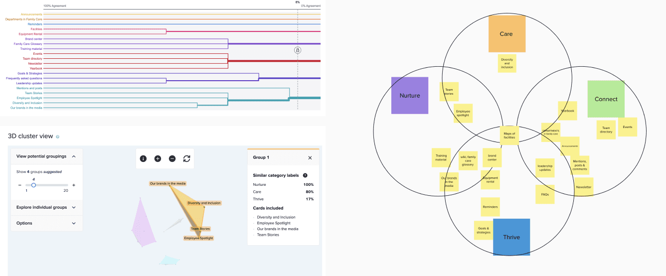
By engaging in card sorting exercises, we gained insights into how participants would organize both existing and new categories within the Information Architecture.
We carried out two open card sorting exercises to assign labels to the categories, and one close card sorting exercise to dive into the users' mental models regarding the values system.
KEY TAKEAWAYS FROM RESEARCH
Culture & collaboration
100% users agree an intranet site should be used to build culture and enhance collaboration between teams.
Daily usage
80% of the employees would use the intranet site on a daily basis, mostly to find updates, news and events.
New categories
Additional categories like "The Vibe Vision" and "Resources" were needed for more intuitive actions on the site.
The vibe to thrive
The family care's vision, along its 4 new core pillars, care, connect, nurture and thrive, required reinforcement across multiple touchpoints to educate employees and build awareness.
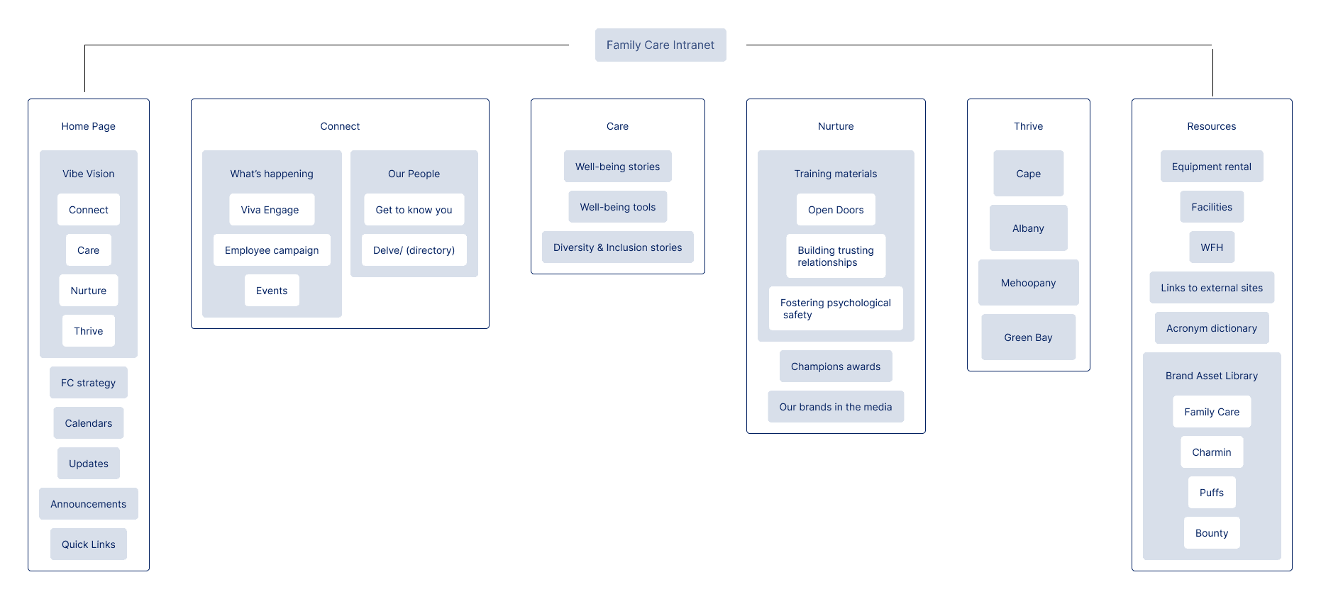
REDEFINING THE INFORMATION ARCHITECTURE
Based on the results gotten form the surveys and the card sorting exercises, I proceeded to propose a new information architecture for the site, this included all the new categories given by the new Vibe's vision and the additional categories created for a better and more intuitive experience for users such as the "Home page" and "Resources".
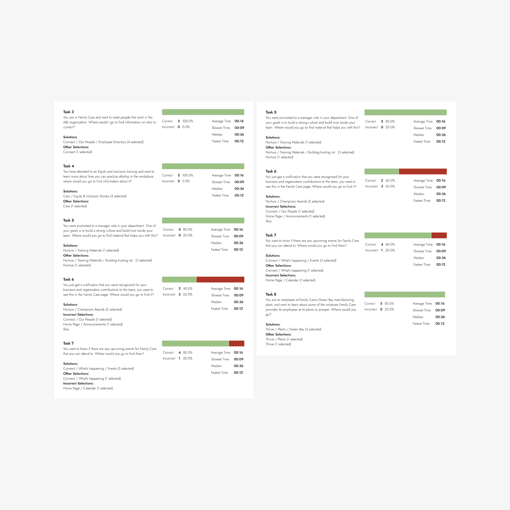
Testing the Information Architecture
The tree test exercise was used to test the proposed information architecture, by giving users fictional scenarios and navigation links to explore.I gave 10 participants fictional scenarios on the site with a total of 10 tasks to complete. For this exercise I used the tool Optimal Workshop.
HOW MIGHT WE
How might we create an internal site that connects, communicates, celebrates, enables and creates a sense of belonging among the people in the Family Care business unit?
EXPLORING IDEAS
Based on the results gotten form the surveys and the card sorting exercises, I proceeded to propose a new information architecture for the site, this included all the new categories given by the new Vibe's vision and the additional categories created for a better and more intuitive experience for users such as the "Home page" and "Resources".
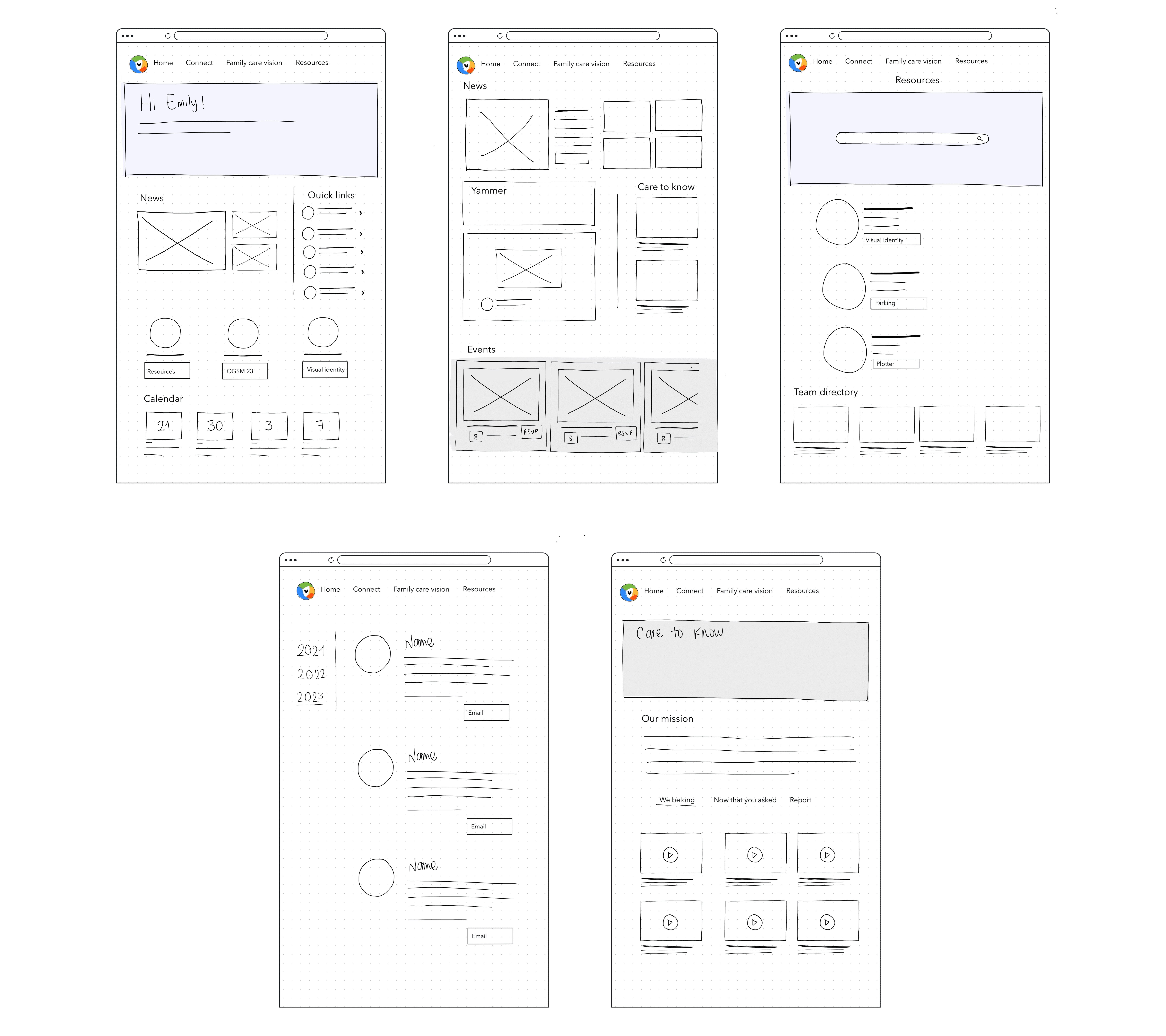
Early explorations
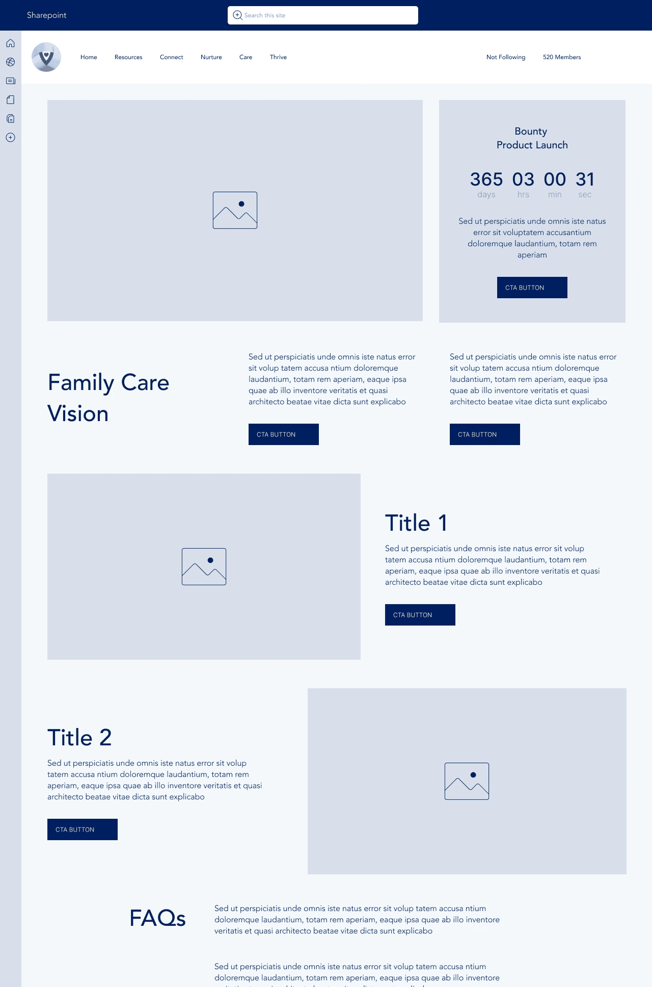
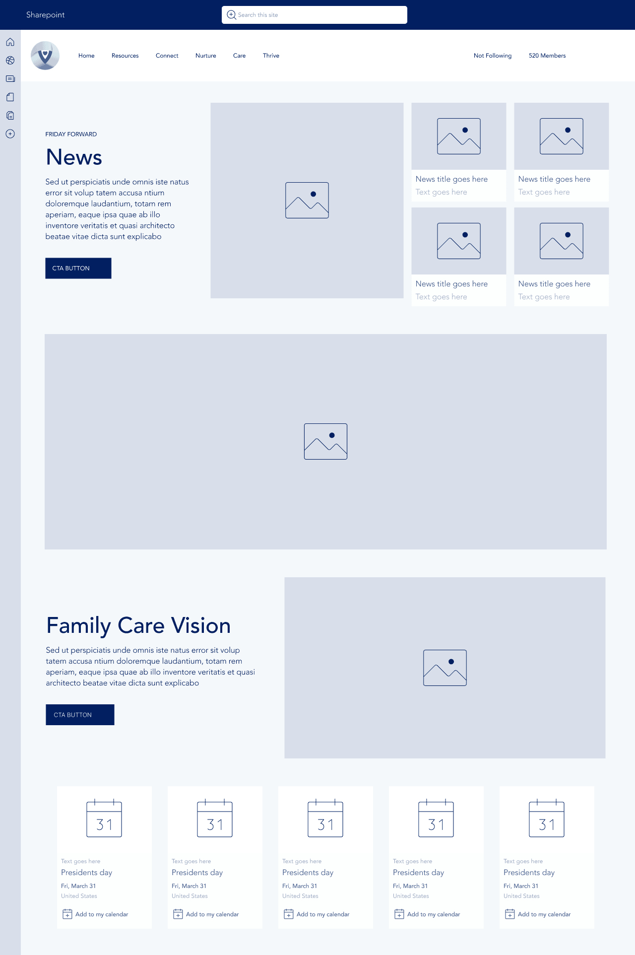
I began generating some low fidelity wireframes for each page of the website to explore potential layouts and the components that were going to address user's needs and concerns.
Feedback:
How do we marry SBUs and The Vibe Pillars.
The vibe is Family Care’s vision
Build the Umbrella site for the 4 vibe pillars: connect, care, thrive, nurture
WIREFRAMES
Based on the results gotten form the surveys and the card sorting exercises, I proceeded to propose a new information architecture for the site, this included all the new categories given by the new Vibe's vision and the additional categories created for a better and more intuitive experience for users such as the "Home page" and "Resources".
VALIDATION WITH USERS
With a total of 11 pages designed in mid-fidelity wireframes, it was time to test them. I conducted a first impression and usability test to learn more about their behavior on the site and some improvements I could do to the pages considering our constraints.
Some of the questions asked were:
What do you think this website is for?
What stands out from this page?
Can you navigate the site and get to the Charmin guidelines in the brand center?
Feedback:
Website to find resources, existing work and hear the latest FC updates.
Calendar, directory and product launch countdown features were the favorites.
It's easy to navigate and intuitive.
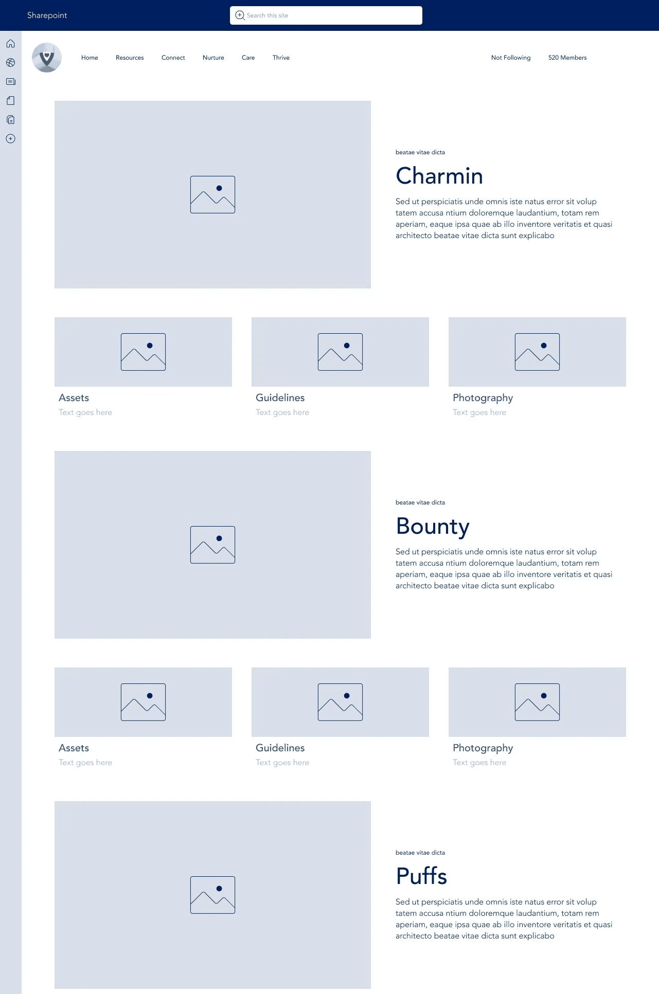
THE FINAL PRODUCT
Based on the results gotten form the surveys and the card sorting exercises, I proceeded to propose a new information architecture for the site, this included all the new categories given by the new Vibe's vision and the additional categories created for a better and more intuitive experience for users such as the "Home page" and "Resources".
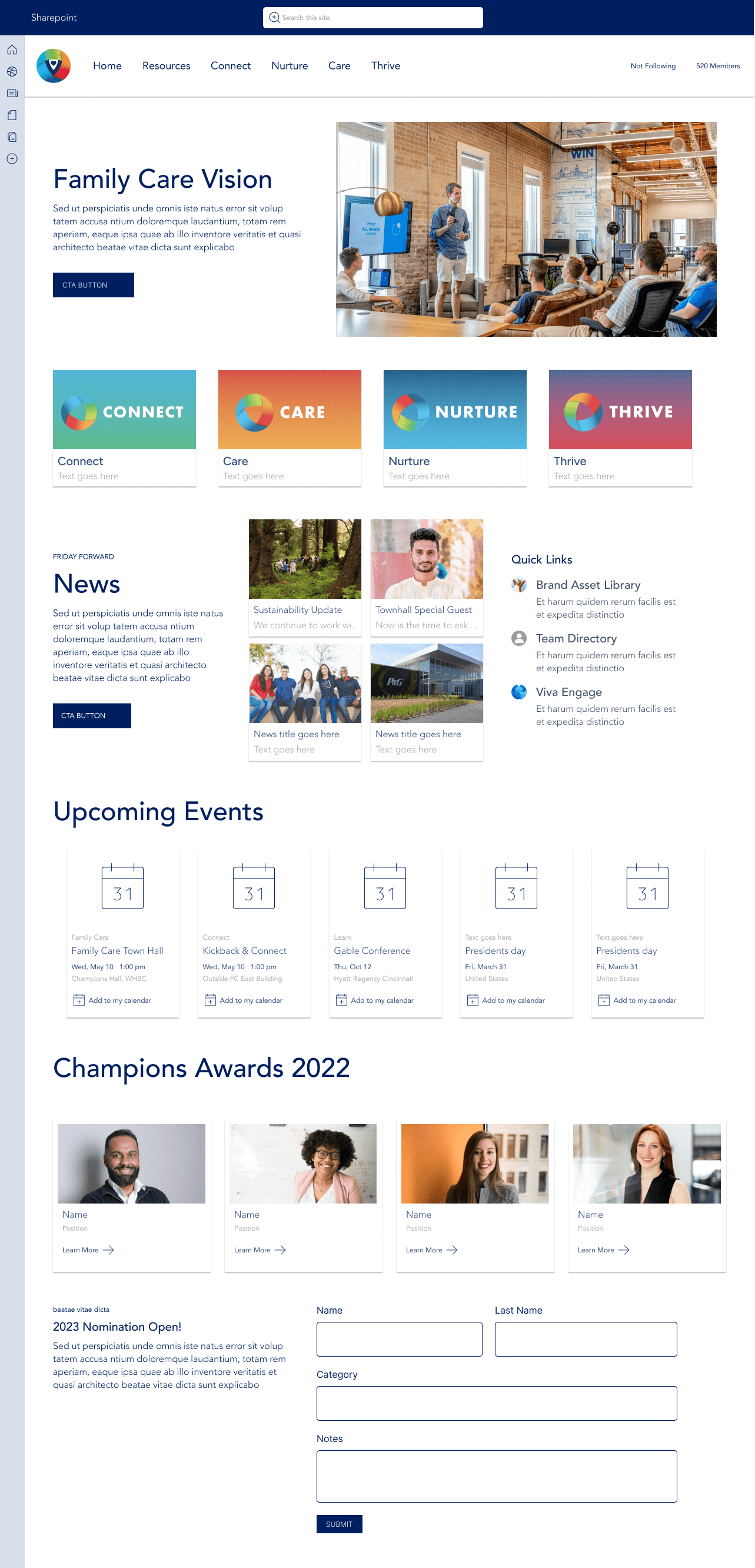
Home page
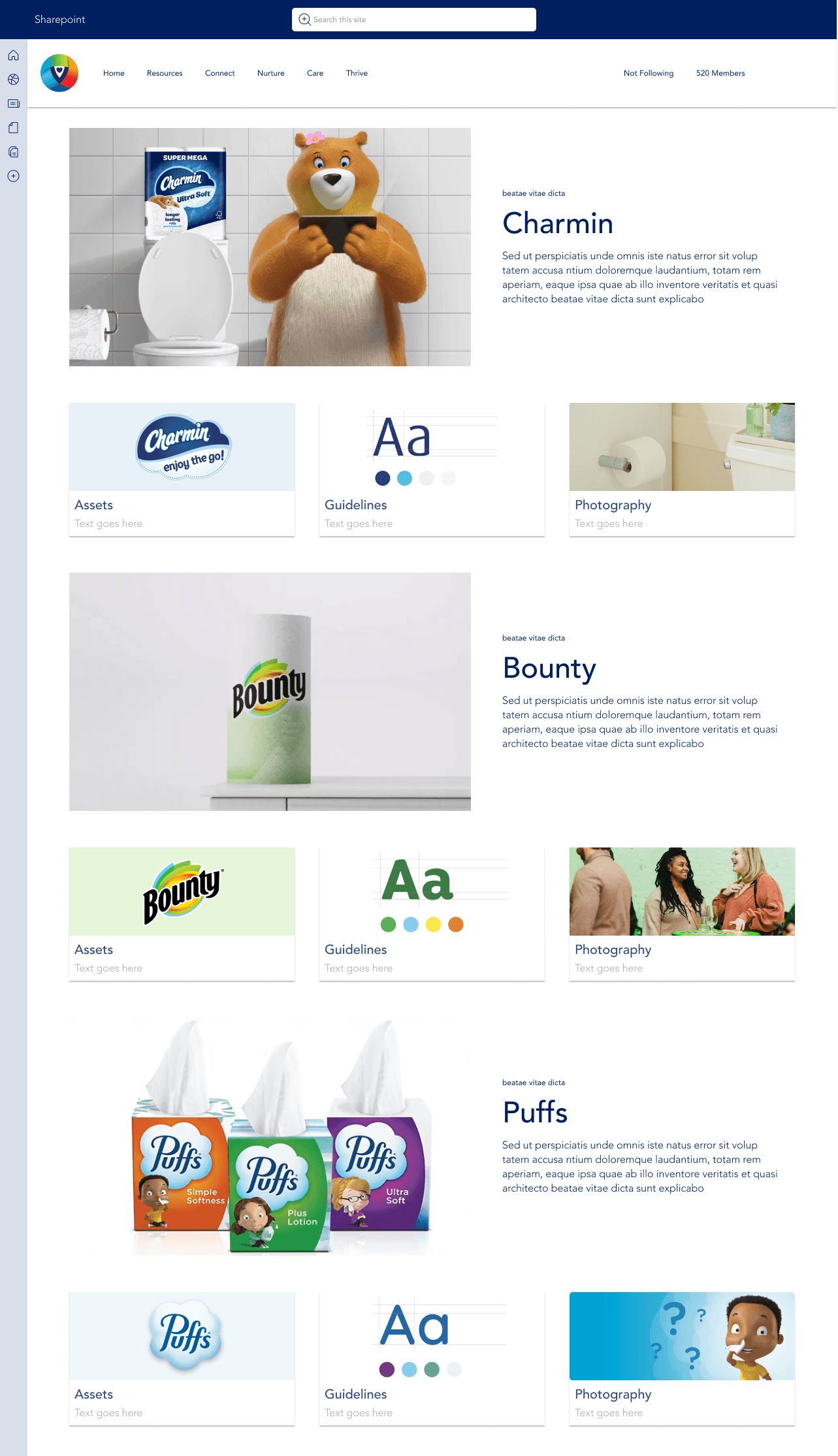
Brand center
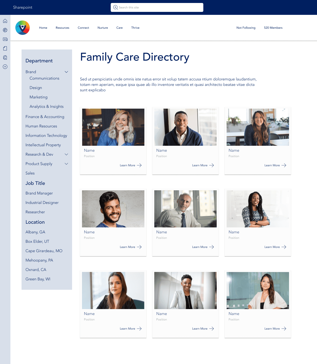
Team directory
Care page
Key learnings
Always prioritize user needs and motivations, grounding design decisions in extensive research.
Engage and communicate with stakeholders continuously to align design impact with business goals and user needs.
Understand design constraints from very early. Prior to initiating design, thoroughly comprehend technology, project requirements, and constraints to make informed decisions.
Confidently articulate and defend your design ideas and choices, backed by research and user-centered principles.Usability tests are so critical in the success of a product and you should conduct as many as needed.
